Big Data Visualization of COVID-19 using Augmented Reality (AR)
ISBN TBA
DIO TBA
PUBLISHER.
AUTHOR/S/. Young Ae Kim & Qiuwen Li
CATEGORIES. Data Visualization
KEYWORDS. Augmented Reality, COVID-19, Coronavirus, Epidemics, pandemics, Time Series Analysis
ABSTRACT.
The Coronavirus disease 2019 (COVID-19) pandemic has led to unprecedented disruption of global daily life. The United States of America is a hotspot for the COVID-19 and leads the world in confirmed cases and deaths. The global impact of coronavirus is extremely overwhelming, despite the rapid vaccine development and inoculation. A vast quantity of COVID-19 data has been produced and gathered from a variety of data sources. Careful observations and implementations of the epidemiological big data is valuable for the broad audience of researchers, policy makers, healthcare providers, and the general public, and inspires the innovation of identifying, controlling, combating, and preventing the virus. The data itself is abstract and not interactive. The visualization process with big data creates visible elements (shapes and symbols) and visual properties (size, color, position, etc.) that represent the meaning of these abstract data, which makes data comprehensive and discovers the important pattern of data.
This research presents a big data visualization with analyzed COVID-19 epidemiological data from various rich data sources using Augmented Reality (AR) the six national and international data sources. Combining AR and data visualization increases intuition and the relationships between the high dimensional dataset. It provides new forms of interactions – touch, speech, proxemics, gestures, gaze, wearables, to access detailed content and motivates users to collaborate.
The visualization was curated into a pictorial format that allows vast amounts of epidemiological data immediately using preattentive visual properties and popular visualization techniques. A combination of a qualitative palette and preattentive visual properties encouraged to identify a summary of unseen patterns, revealing insights, discovering areas of needs, finding errors in the current system, and directions in the future. The systematic modular grid provided flexibility to fit the data visualization with various types of data sets. The data visualization of COVID-19 using AR provides users meaningful interaction and better understanding of confirmed cases, deaths, social distancing, unemployment cases, vaccination rates, and economic impact of COVID-19 epidemiological data. The big data visualization of COVID-19 is designed for visualization of epidemiological data with pleasurable interactive features, which can be utilized in visualization of big data from other applications and services. Looking at the loneliest and darkest years of 2020 and 2021 with COVID-19 Big Data set is challenging; however, bright colors and movement in VR were carefully utilized to inspire positive emotions from users while exploring the heartbreaking data set.

(a) systematic modular grid a 50 x 50 grid. (b) a 7 x 7 column grid using a 50 x 50 grid with geographical location system.

Qualitative palette and assigned colors of each variable.

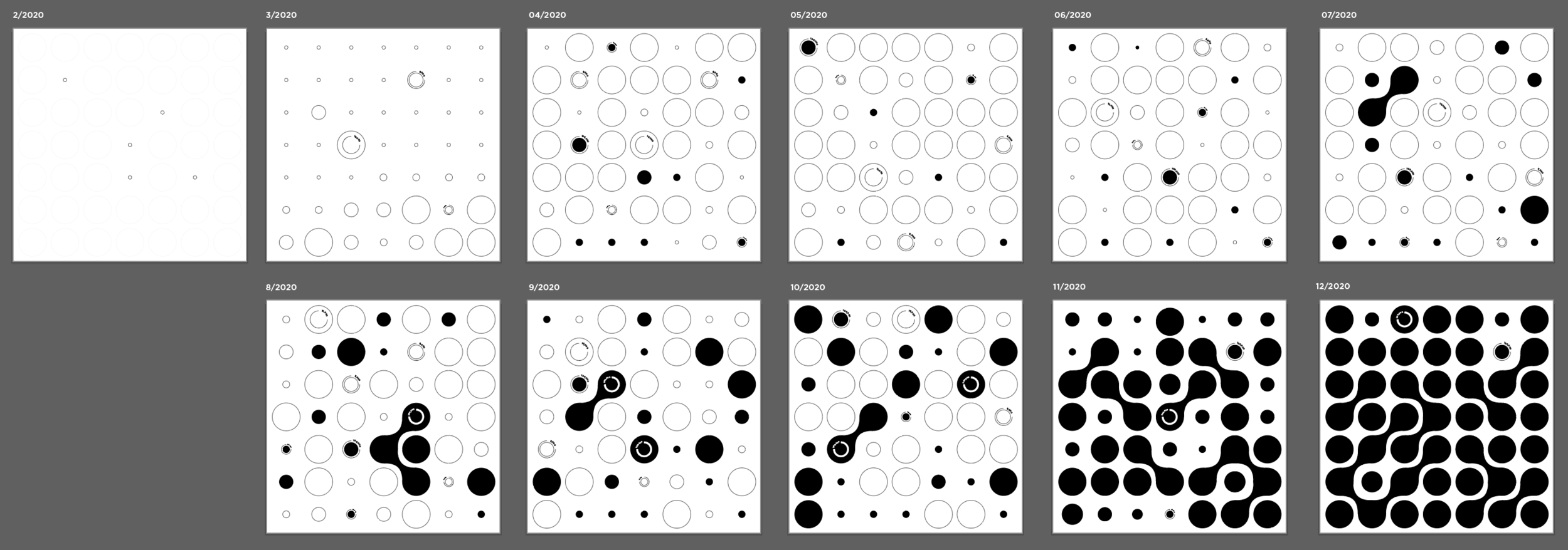
Confirmed case visual mapping units.
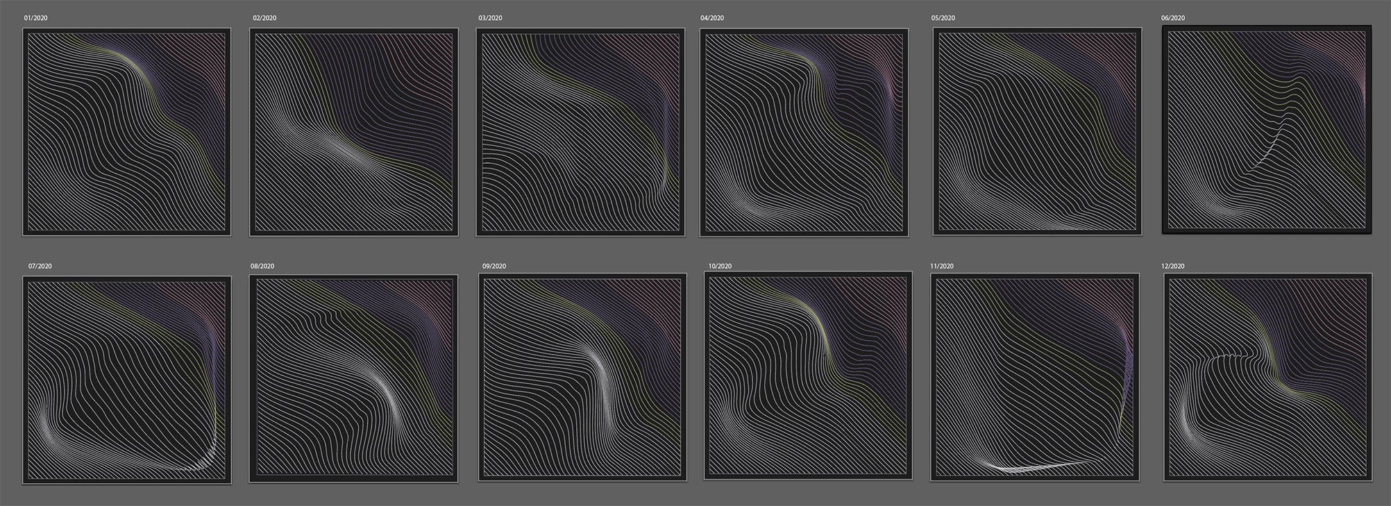
Confirmed Cases
Confirmed cases visual mapping illustrated the confirmed cases of COVID-19 data trend changes from February to December 2020 based on the geographical locations of the United States. The daily data point transformation was not the concern of this design method. The monthly aggregated data transformation provided a significant pattern of data migration and possible prediction of the virus.
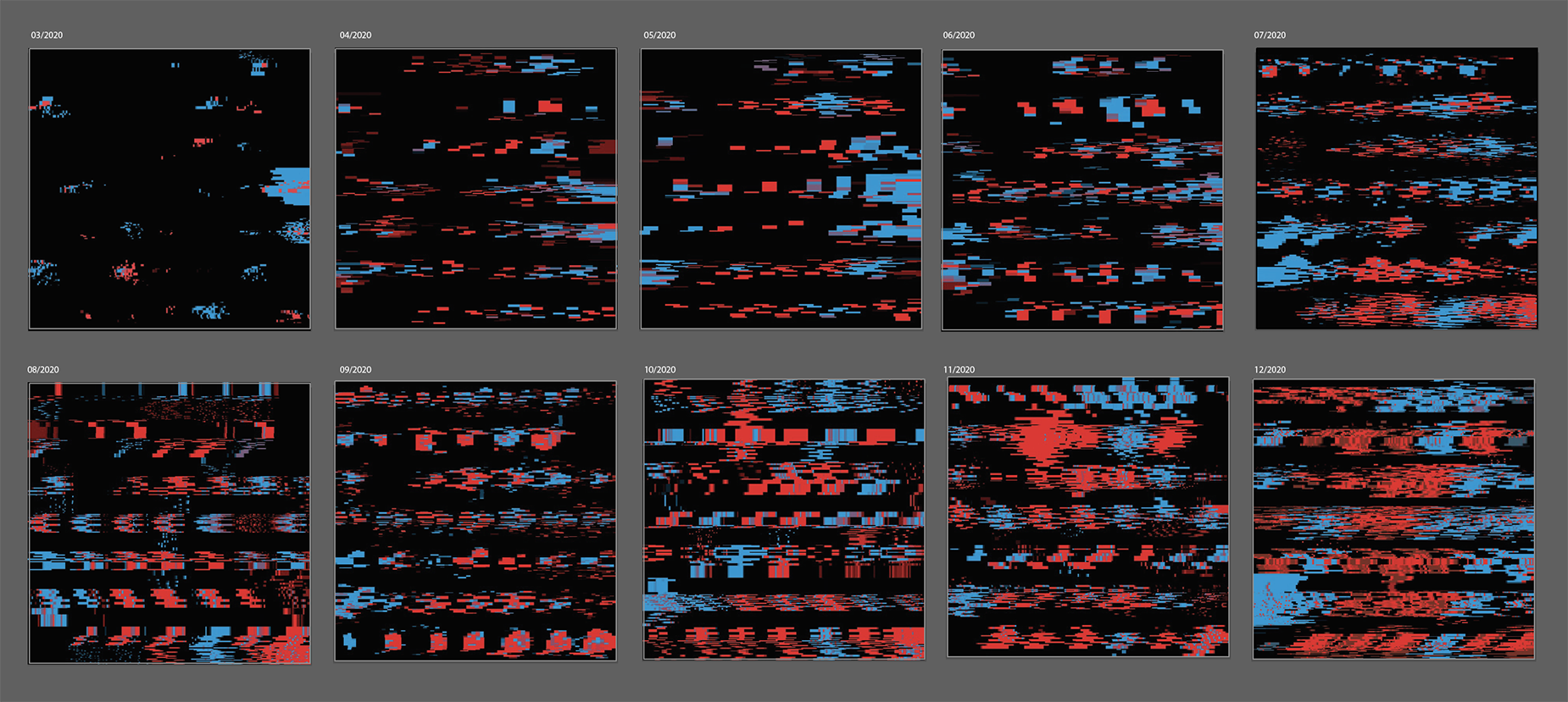
Number of Deaths
The data source for the monthly covid-19 death number visualization comes from the CDC. The measurement for the monthly data set is based on per one million population of each state. A 7 x 7 column grid was utilized due to the geographical location base data set, which assists users’ mental map to position information on relevant areas. Two main preattentive visual properties utilized the science of vision to help viewers compare, contrast, and visualize the information are color and movement. Red and blue were utilized from the qualitative palette, which is a direct representation of political parties – Republican (red) or Democratic(blue) in the United States.
Bring art to life with your smartphone

www.artivive.com
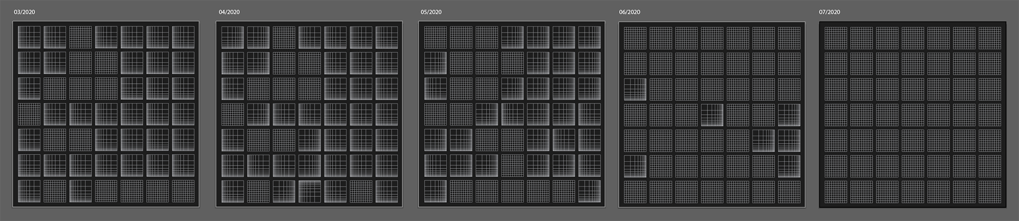
Social Distancing
COVID-19 stay-at-home orders in 2020 by state in the U.S. originates from the Kaiser Family Foundation (KFF). A 7x7 column grid was used to provide the geographical location mapping system for the data set. Each building block was divided into 10x10 small squares to indicate measuring distance in space. As the design displays, there are four statuses of mandatory stay-at-home orders across states: no stay-at-home order; implementing stay-at-home order start; stay-at-home order end; and start and end stay-at-home order at the same month. 2D spatial positioning was the key preattentive visual properties utilized in the social distance category to deliver data that can be easily recognized and processed visually. By varying the distance between the lines inside each unit, it stimulates people’s mind maps to find trends and discover changes over time.
Economic Impact
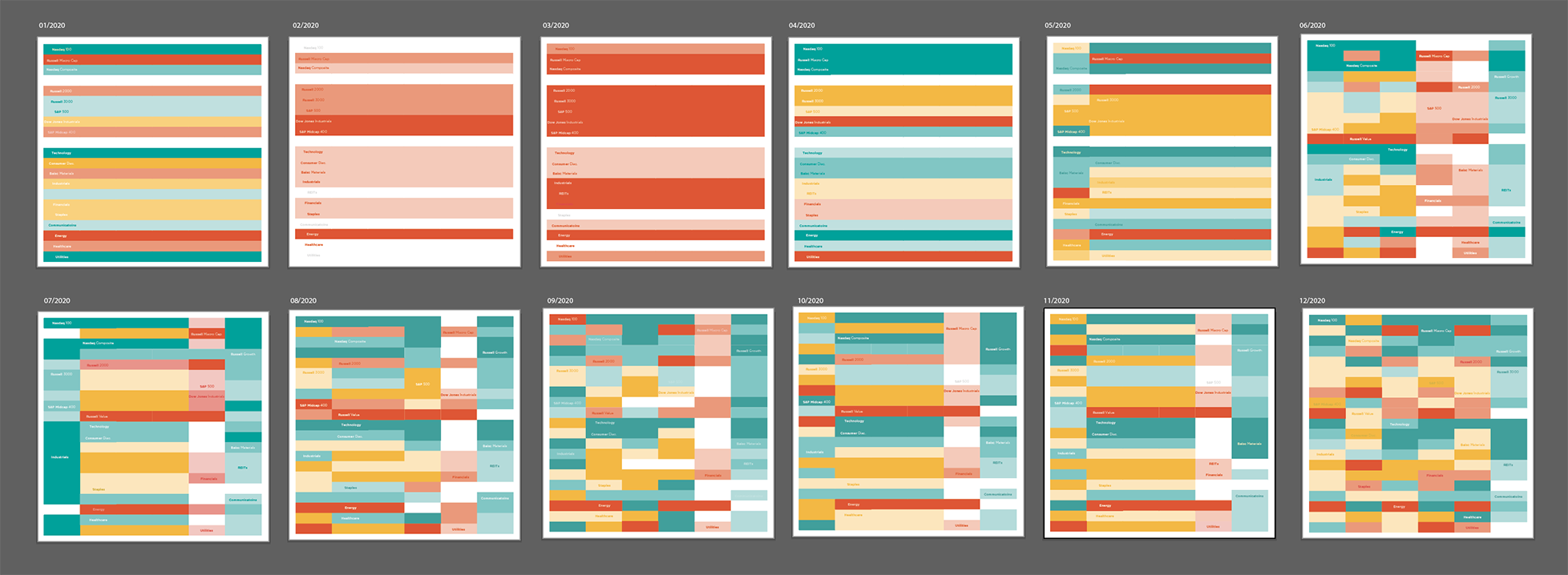
The 144 modules based on the standard systematic modular grid (50 x 50) was produced to formulate a 21x 6 table to utilize the monthly economic data from Nasdaq, Inc. Ten U.S. indices and 11 global industry classification standard (GICS) sectors in a fiscal year (e.g., Q1, Q2, Q3, Q4, week-high, and week-low) was included in this visualization. From top to bottom the 10 US indices includes Nasdaq 100; Russell MicroCap; Nasdaq Composite; Russell Growth; Russell 2000; Russell 3000; S&P 500; Dow Jones Industrials; S&P Midcap 400; and Russell Value. The 11 GICS sectors include Technology; Consumer Disc; Basic Materials; Industrials REITs; Financials; Staples; Communications; Energy; Healthcare; and Utilities. The order does not change to encourage users’ mental map within the data set to reduce the learning curve of data locations. Colors, especially the HSL scale, are carefully chosen to make the economic data become easily recognized and processed visually.
Unemployment
The data from the United States unemployment correlation to race in 2020 from U.S. Bureau of Labor Statistics was utilized in data visualization for this category. This data set displays the unemployment case statistics by race – Caucasian, African American, Asian, and Hispanic. Data was standardized by percentage that illustrate the proportion of each race in the total unemployment case number of each month. The standardized systematic modular grid of a 50 x 50 grid provides 81 diagonal lines as a unit of data point. Each line in 81 units represents 1.236 percent of the proportion of total data points by each month. Monthly unemployment data points were standardized based on 81 units of proportion placement of each race, which demonstrates the visual mapping of the proportional unemployment case by each race monthly. For example, 6,738 (total of 81 units) unemployment occurred in January 2020 that included 3,863 (46 units) unemployment case in Caucasian, 1,275 (15 units) unemployment case in African American, 315 (4 units) unemployment case in Asian, and 1,282 (15 units) unemployment case in Hispanic.

Vaccination Rates
The United States COVID-19 vaccinations from the CDC was applied in the vaccination rate data visualization. A 50 x 50 grid employed to create an alphabetic order of states in the U.S. Color property took the dominant role in vaccination rates visualization. Full range colors were used to indicate each state in the U.S. Hue in the order of color spectrum was used to reference the order of alphabets that encouraged the one’s mental map to explore information in hierarchical order. Patterns are used to create visual interests rather than repetitions of blocks of colors. Figure 20 demonstrates movement in AR illustrating the migration of vaccination rates data.

References.
Ajilore, O., & Thames, A. D. (2020). The fire this time: the stress of racism, inflammation and COVID-19. Brain, behavior, and immunity, 88, 66.
Azuma, R., Baillot, Y., Behringer, R., Feiner, S., Julier, S., & MacIntyre, B. (2001). Recent advances in augmented reality. IEEE computer graphics and applications, 21(6), 34-47.
Brooks, S. K., Webster, R. K., Smith, L. E., Woodland, L., Wessely, S., Greenberg, N., & Rubin, G. J. (2020). The psychological impact of quarantine and how to reduce it: rapid review of the evidence. The lancet, 395(10227), 912-920.
Buheji, M., & Ahmed, D. (2020). Foresight of Coronavirus (COVID-19) opportunities for a better world. American Journal of Economics, 10(2), 97-108.
Chandra, A. N. R., El Jamiy, F., & Reza, H. (2019, December). Augmented reality for big data visualization: a review. In 2019 International Conference on Computational Science and Computational Intelligence (CSCI) (pp. 1269-1274). IEEE.
Childs, H., Geveci, B., Schroeder, W., Meredith, J., Moreland, K., Sewell, C., ... & Bethel, E. W. (2013). Research challenges for visualization software. Computer, 46(5), 34-42.
Cook, K. A., & Thomas, J. J. (2005). Illuminating the path: The research and development agenda for visual analytics (No. PNNL-SA-45230). Pacific Northwest National Lab.(PNNL), Richland, WA (United States).
Deering, M. F. (1998, May). The limits of human vision. In 2nd International Immersive Projection Technology Workshop (Vol. 2, p. 1).
Demchenko, Y., De Laat, C., & Membrey, P. (2014, May). Defining architecture components of the Big Data Ecosystem. In 2014 International conference on collaboration technologies and systems (CTS) (pp. 104-112). IEEE.
Dur, B. I. U. (2014). Data visualization and infographics in visual communication design education at the age of information. Journal of Arts and Humanities, 3(5), 39-50.
Field, D. J., Hayes, A., & Hess, R. F. (1993). Contour integration by the human visual system: evidence for a local “association field”. Vision research, 33(2), 173-193.
Fonseca, D., Villagrasa, S., Martí, N., Redondo, E., & Sánchez, A. (2013). Visualization methods in architecture education using 3D virtual models and augmented reality in mobile and social networks. Procedia-Social and Behavioral Sciences, 93, 1337-1343.
Healey, C. G. (2007). Perception in visualization. Retrieved February, 10, 2008.
Ho, J. (2021, January). Anti-Asian racism, Black Lives Matter, and COVID-19. In Japan Forum (Vol. 33, No. 1, pp. 148-159). Routledge.
Jiang, F., Leung, C. K. S., & Tanbeer, S. K. (2012, November). Finding popular friends in social networks. In 2012 Second International Conference on Cloud and Green Computing (pp. 501-508). IEEE.
Jonker, D., Brath, R., & Langevin, S. (2019, July). Industry-driven visual analytics for understanding financial timeseries models. In 2019 23rd International Conference Information Visualisation (IV) (pp. 210-215). IEEE.
Kim, T., & DiSalvo, C. (2010). Speculative visualization: A new rhetoric for communicating public concerns.
Kipper, G., & Rampolla, J. (2012). Augmented Reality: an emerging technologies guide to AR. Elsevier.
Komodakis, N., & Pesquet, J. C. (2015). Playing with duality: An overview of recent primal? dual approaches for solving large-scale optimization problems. IEEE Signal Processing Magazine, 32(6), 31-54.
Krum, R. (2013). Cool infographics: Effective communication with data visualization and design. John Wiley & Sons.
Laney, D. (2001). 3D data management: Controlling data volume, velocity and variety. META group research note, 6(70), 1.
Laster Pirtle, W. N. (2020). <? covid19?> Racial Capitalism: A Fundamental Cause of Novel Coronavirus (COVID-19) Pandemic Inequities in the United States. Health Education & Behavior, 47(4), 504-508.
Lupton, E. (2014). Thinking with type: A critical guide for designers, writers, editors, & students. Chronicle Books.
Le Bras, P., Gharavi, A., Robb, D. A., Vidal, A. F., Padilla, S., & Chantler, M. J. (2020). Visualising covid-19 research. arXiv preprint arXiv:2005.06380, 1.
Ma, M., Jain, L. C., & Anderson, P. (2014). Future trends of virtual, augmented reality, and games for health. In Virtual, augmented reality and serious games for healthcare 1 (pp. 1-6). Springer, Berlin, Heidelberg.
Manav, B. (2007). Color‐emotion associations and color preferences: A case study for residences. Color Research & Application: Endorsed by Inter‐Society Color Council, The Colour Group (Great Britain), Canadian Society for Color, Color Science Association of Japan, Dutch Society for the Study of Color, The Swedish Colour Centre Foundation, Colour Society of Australia, Centre Français de la Couleur, 32(2), 144-150.
Murphy H, Di Stefano M, Manson K (2020, March 20). Huge text message campaigns spread coronavirus fake news. Financial Times. Retrieved from: https://www.ft.com/content/34b6df5a-ea4a-471f-8ac9-606580480049
Redelmeier, D. A., & Shafir, E. (2020). Pitfalls of judgment during the COVID-19 pandemic. The Lancet Public Health, 5(6), e306-e308.
Riecke, B. E., Feuereissen, D., Rieser, J. J., & McNamara, T. P. (2015). More than a cool illusion? Functional significance of self-motion illusion (circular vection) for perspective switches. Frontiers in Psychology, 6, 1174.
Roberts, K. (2020). Locked down leisure in Britain. Leisure Studies, 39(5), 617-628.
Sadiku, M., Shadare, A. E., Musa, S. M., Akujuobi, C. M., & Perry, R. (2016). Data visualization. International Journal of Engineering Research And Advanced Technology (IJERAT), 2(12), 11-16.
Sonntag, D., Albuquerque, G., Magnor, M., & Bodensiek, O. (2019). Hybrid learning environments by data-driven augmented reality. Procedia Manufacturing, 31, 32-37.
Souza, J., Leung, C. K., & Cuzzocrea, A. (2020). An innovative big data predictive analytics framework over hybrid big data sources with an application for disease analytics. In Advanced Information Networking and Applications (Vol. 1151, p. 669). Nature Publishing Group.
Samara, T. (2017). Making and breaking the grid, updated and expanded: A graphic design layout workshop. Quarry Books Editions.
Stlouis, M. (2017, August 1). How to Spot Visual, Auditory, and Kinesthetic-Learning Executives. Inc. Retrieved from: https://www.inc.com/molly-reynolds/how-to-spot-visual-auditory-and-kinesthetic-learni.html
The New York Times. (2008, February 23). The ebb and flow of movies: Box office Receipts 1986 - 2008. Retrieved from: http://archive.nytimes.com/www.nytimes.com/interactive/2008/02/23/movies/20080223_REVENUE_GRAPHIC.html.
Thompson, D., Levine, J. A., Bennett, J. C., Bremer, P. T., Gyulassy, A., Pascucci, V., & Pébay, P. P. (2011, October). Analysis of large-scale scalar data using hixels. In 2011 IEEE Symposium on Large Data Analysis and Visualization (pp. 23-30). IEEE.
Tu, J., Verhagen, M., Cochran, B., & Pustejovsky, J. (2020). Exploration and discovery of the covid-19 literature through semantic visualization. arXiv preprint arXiv:2007.01800.
Tukey, J. W. (1962). The future of data analysis. The annals of mathematical statistics, 33(1), 1-67.
Ward, M. O., Grinstein, G., & Keim, D. (2010). Interactive data visualization: foundations, techniques, and applications. CRC press.
Ware, C. (2019). Information visualization: perception for design. Morgan Kaufmann.
WHO (2021, September 3). WHO Coronavirus (COVID-19) Dashboard from 2020 to 2001. WHO. Retrieved from: https://covid19.who.int/
Williams, L. G. (1966). The effect of target specification on objects fixated during visual search. Perception & Psychophysics, 1(5), 315-318.
Wolinski, F. (2020). Visualization of diseases at risk in the COVID-19 Literature. arXiv preprint arXiv:2005.00848.
Yabuki, N., Furubayashi, S., Hamada, Y., & Fukuda, T. (2012, September). Collaborative visualization of environmental simulation result and sensing data using augmented reality. In International Conference on Cooperative Design, Visualization and Engineering (pp. 227-230). Springer, Berlin, Heidelberg.
Zuo, F., Wang, J., Gao, J., Ozbay, K., Ban, X. J., Shen, Y., ... & Iyer, S. (2020). An interactive data visualization and analytics tool to evaluate mobility and sociability trends during covid-19. arXiv preprint arXiv:2006.14882.